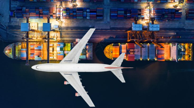
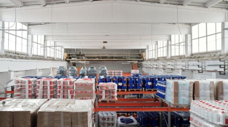
How to judge color conformity during an inspection

A common question I receive from clients is how AQF, or any other inspection company for that matter, can verify that their product color conformity fits perfectly with the golden sample. While of course, an inspector can generally use the naked eye to judge color differences, more specific discrepancies are sometimes not caught by the eye alone.
This is where the Pantone Matching System comes in. Similar looking to a paint color swatch book you can find at your local hardware store, the Pantone is a universal standard for judging colors. Since there are so many different shades, an inspector can use the Pantone to ensure that the products he is inspecting match the sample color exactly. Since color is so subjective, and because after hours of inspecting, inspectors eye’s may start shifting, using a Pantone is especially important.
The three most commonly-used types of Pantone codes are:
- U: for products with matt (uncoated) surface
- C: for products with shiny (coated) surface
- TPX: for textile products
Chances are, your suppliers will use one of these three standards when they communicate with you. They probably won’t have another book, and they might not be willing to purchase it just for you.
As a final note, Pantones must be replaced regularly to ensure that no fading has occurred. However, with proper usage, the Pantone system can be an excellent tool in everyone’s QC process.
And you: do you use the Pantone book when communicating with your suppliers? Do you see any limitation?
Keywords:
[…] How to judge color conformity during an inspection […]